Website Design Impact Calculator
Estimate how specific design improvements can enhance user trust, engagement, and conversion rates based on current web standards.
Most websites fail within the first five seconds. You have that brief window to grab attention before a visitor decides your site is boring, confusing, or simply not worth their time. If you are struggling to keep people on your pages, it is usually not because your content is bad. It is because your design is invisible.
Making your website stand out does not mean cluttering it with flashy animations or neon colors. In fact, in 2026, the trend is moving toward clean, intentional design that respects the user's intelligence and time. The goal is to create a digital space that feels unique yet familiar enough to navigate easily. This guide breaks down practical, high-impact strategies to elevate your web presence without needing a massive budget or a team of developers.
Master the Art of Visual Hierarchy
Visual hierarchy is the backbone of any effective website designthat guides the user's eye through content in order of importance. Without it, users scan your page randomly, missing key messages and calls to action. Think of your layout as a conversation where you lead the guest by the hand.
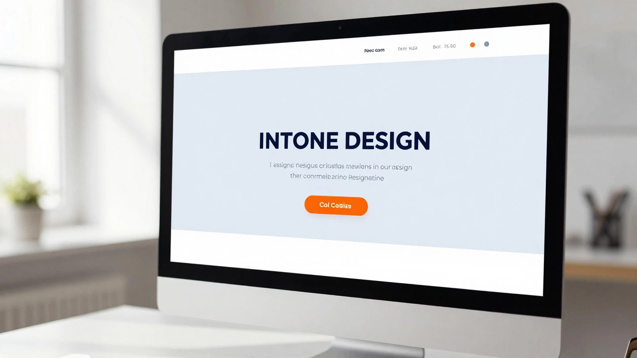
To establish strong hierarchy, use size, color, and spacing strategically. Your main headline should be significantly larger than subheads, which in turn should be larger than body text. Use a contrasting color for your primary call-to-action (CTA) buttons. For example, if your site uses cool blues and grays, make your "Sign Up" button a warm orange or yellow. This creates a focal point that draws the eye immediately.
White space, often called negative space, is your best friend here. Amateurs fear empty space; professionals use it to let content breathe. Group related elements together and separate unrelated ones with generous padding. This reduces cognitive load, making your site feel faster and more professional even if the loading speed is average.
- Use font sizes to indicate importance (H1 > H2 > Body).
- Apply bold weights sparingly to highlight key phrases.
- Ensure CTA buttons contrast sharply with the background.
- Leave ample margins around images and text blocks.
Prioritize Mobile-First Responsiveness
In 2026, designing for desktop first is a relic of the past. More than half of global web traffic comes from mobile devices, and Google’s indexing prioritizes the mobile version of your site. If your site looks good on a laptop but breaks on a smartphone, you are losing potential customers instantly.
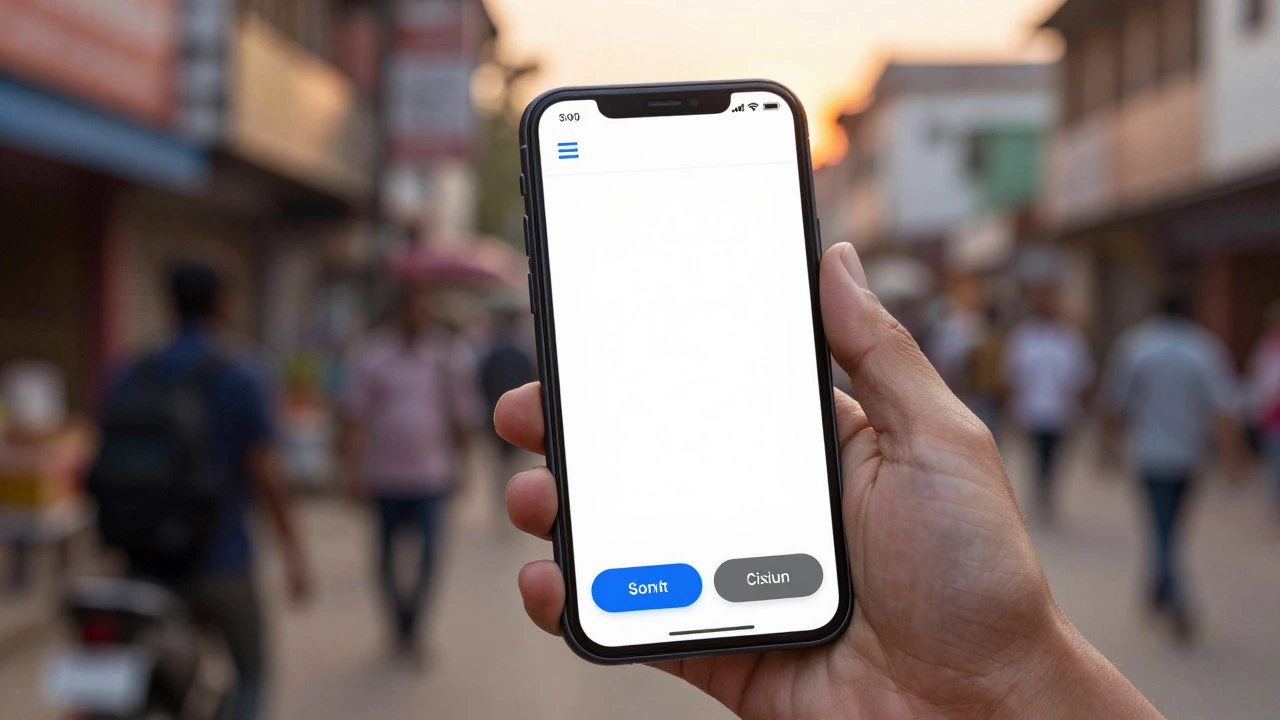
Mobile-first design means starting with the smallest screen and scaling up. This forces you to prioritize content. You cannot fit everything on a phone screen, so you must decide what truly matters. Navigation menus should collapse into easy-to-tap hamburger icons. Buttons need to be large enough for thumbs-aim for at least 44x44 pixels. Images must resize fluidly without distorting.
Test your site on actual devices, not just browser developer tools. Real-world usage reveals issues like text being too small to read or links being too close together. A seamless mobile experience signals trust. Users assume that if a business cannot manage its mobile site, it cannot manage its products or services either.
Leverage Authentic Visual Storytelling
Stock photos are the enemy of standing out. They look generic, staged, and dishonest. Visitors can spot a stock image of "business people shaking hands" from a mile away. To build an emotional connection, use authentic visuals. This means real photos of your team, your office, your products in use, or your customers.
If you do not have a professional photographer, modern smartphones are sufficient. Edit them consistently using tools like Lightroom or Canva to maintain a cohesive brand palette. Consistency in tone and lighting makes your site feel curated rather than chaotic.
Beyond photography, consider custom illustrations or iconography. These assets can reflect your brand personality in ways photos cannot. A playful brand might use hand-drawn doodles, while a fintech company might opt for sleek, geometric lines. Custom graphics also load faster than heavy photo files, improving performance scores.
| Strategy | Impact on User Trust | Cost & Effort | Best For |
|---|---|---|---|
| Stock Photos | Low (Feels Generic) | Low | Quick placeholders only |
| Authentic Photography | High (Builds Connection) | Medium | Brands with physical presence |
| Custom Illustrations | Very High (Unique Identity) | High | SaaS, Creative Agencies |
| User-Generated Content | High (Social Proof) | Low | E-commerce, Community Brands |
Optimize for Speed and Performance
A beautiful site is useless if it loads slowly. Core Web Vitals are critical ranking factors for search engines and major drivers of user retention. Studies show that as page load time goes from one second to three seconds, the probability of bounce increases by 32%. Users expect instant gratification.
Start by compressing images. Use modern formats like WebP or AVIF instead of JPEG or PNG. These formats offer superior compression with minimal quality loss. Next, minify CSS and JavaScript files to remove unnecessary characters and whitespace. Enable browser caching so returning visitors do not have to download static assets repeatedly.
Choose a reliable hosting provider. Shared hosting is cheap but often slow due to resource sharing with other sites. Managed WordPress hosting or cloud solutions like AWS or DigitalOcean provide better performance stability. Regularly audit your plugins; each active plugin adds code bloat that slows down your site.
Create Intuitive Navigation Structures
Navigation is how users find their way around your site. If they get lost, they leave. Keep your main menu simple. Limit top-level items to seven or fewer. Use clear, descriptive labels like "Services" or "About Us" instead of clever but vague terms like "What We Do" or "Our Story."
Implement a sticky header that remains visible as users scroll. This ensures navigation is always accessible without forcing them to scroll back to the top. Include a prominent search bar, especially if you have a large amount of content like a blog or e-commerce catalog. Breadcrumbs help users understand their location within the site hierarchy, reducing frustration.
Internal linking is crucial for both UX and SEO. Link related articles or products within your content. This keeps users engaged longer and distributes page authority across your site. Use descriptive anchor text that tells users exactly what they will find when they click.

Implement Clear Calls to Action
Every page on your website should have a purpose. What do you want the visitor to do next? Buy a product? Subscribe to a newsletter? Contact sales? Your Call to Action (CTA) must be obvious and compelling.
Use action-oriented language. Instead of "Submit," try "Get My Free Guide" or "Start Your Trial." Place CTAs above the fold, but also repeat them throughout long-form content. Contextual CTAs perform better than generic ones. For example, after explaining a problem, offer a solution via a CTA.
Reduce friction in forms. Ask for only the information you absolutely need. Each additional field decreases conversion rates. Use inline validation to alert users of errors immediately rather than after they submit the form. Make the process feel effortless.
Focus on Accessibility and Inclusivity
Accessibility is no longer optional; it is a legal requirement in many regions and a moral imperative. An accessible site is usable by everyone, including those with disabilities. This expands your audience and improves SEO, as many accessibility practices align with search engine guidelines.
Ensure all images have alt text describing their content. This helps screen readers convey meaning to visually impaired users. Maintain sufficient color contrast between text and backgrounds. Tools like WebAIM Contrast Checker can verify compliance. Add keyboard navigation support so users who cannot use a mouse can browse your site.
Use semantic HTML tags correctly. Headings, paragraphs, and lists should be marked up appropriately. This structure aids assistive technologies in parsing your content. Testing with screen readers like NVDA or VoiceOver provides valuable insights into the user experience for disabled visitors.
How much does it cost to redesign a website?
The cost varies widely depending on complexity. A basic template-based site might cost $500-$2,000. Custom designs range from $5,000 to $50,000+. Factors include number of pages, custom functionality, and whether you hire freelancers or agencies. Always budget for ongoing maintenance and hosting.
What are the biggest mistakes in website design?
Common mistakes include poor mobile responsiveness, slow loading speeds, cluttered layouts, weak calls to action, and ignoring accessibility standards. Another major error is failing to update content regularly, which makes the site appear abandoned.
Do I need a designer to make my site stand out?
Not necessarily. Many DIY platforms like Squarespace or Wix offer professional templates. However, a designer can provide custom branding and unique interactions that templates lack. If budget allows, investing in professional design yields higher returns in user engagement and conversions.
How often should I update my website design?
Major redesigns every 3-5 years are typical. However, minor updates to content, images, and functionality should happen monthly. Trends change quickly, so keeping up with current UI patterns ensures your site doesn't feel outdated. Regular audits help identify areas for improvement.
Is white space really important in web design?
Yes, white space is critical. It improves readability, highlights important elements, and creates a sense of luxury and professionalism. Cluttered designs overwhelm users and increase bounce rates. Strategic use of negative space guides the eye and enhances overall user experience.