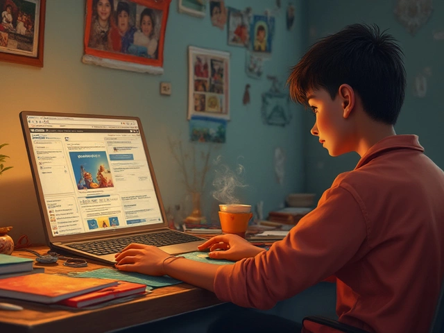
Most people think you need to be some sort of wizard to start web design. Nope. You just need a bit of curiosity and the right approach. Before you touch any code or drag any elements, ask yourself—what do you want your site to do? A portfolio, a blog, a store? That answer shapes every step next.
Don’t get stuck trying to master everything at once. Focus on what matters: one simple website with clear goals. Think of it like cooking your first meal—start with eggs, not a five-course feast. Believe it or not, some of the cleanest sites out there use just a few sections, basic colors, and easy navigation. That’s good design.
The web is full of free and simple tools to help you out. Platforms like Wix, Squarespace, or WordPress are beginner-friendly, so you won’t need to fuss over complicated stuff just to get going. You don’t even have to write code unless you’re curious to learn. There’s no badge for struggling more than you need to.
- What Is Web Design, Really?
- Pick Your Tools: Software and Platforms
- Simple Layouts That Just Work
- Colors, Fonts, and Images—No Guessing
- Staying Clear of Beginner Mistakes
- Ready, Set, Launch: Final Checks
What Is Web Design, Really?
Let’s cut through the buzzwords. Web design is just putting together stuff on a website so that people find it useful, easy to use, and not ugly to look at. It’s a mix of looks (colors, fonts, spacing) and how everything actually works (menus, buttons, links). You might hear terms like UI (User Interface) and UX (User Experience)—they just mean you want the site to work well and look good while doing it.
For beginners, it helps to split web design into two types:
- Visual Design: What the visitor sees—layout, colors, pictures, videos, and text.
- Functionality: How the site behaves when someone clicks or taps—menus open, videos play, forms send email, etc.
Most people start a web design project focusing too much on looks, but the real pros know structure matters even more. Think of the web’s most popular sites—YouTube, Wikipedia, Amazon. They’re not flashy, but they’re super easy to use.
Here’s a quick fact: According to a 2023 study from Stanford, 75% of users judge a company’s credibility by its website design. Clean, simple, and easy-to-navigate beats wild colors or spinning animations every single time.
| Key Aspect | Why It Matters |
|---|---|
| Navigation | Makes it easy for visitors to find what they need fast |
| Readability | If people can’t read your text, they’ll leave right away |
| Mobile-friendly | Over 55% of web traffic comes from phones, so sites have to work well on mobile |
At its core, web design is all about your visitor. If you make things clear and simple for them, you’re doing it right—even if your first site just has a few pages. Keep that mindset, and you’ll avoid a ton of headaches down the line.
Pick Your Tools: Software and Platforms
This is where a lot of web design beginners get hung up, but you don’t need a giant toolbox. Let’s clear this up: you just need one solid platform to get started. Don’t stress about picking the "best" one—focus on what’s easy to use and helps you get a site out there fast.
If you want a drag-and-drop approach with zero coding, Wix is the simplest. It comes with loads of pre-built templates you can tweak just by clicking around. If you like a bit more style but still want to keep it easy, Squarespace is perfect for beginners who care about nice fonts and clean layouts. WordPress.com gives you more flexibility if you think you’ll grow your site later (note: WordPress.org is for people who want more control and don’t mind fiddling with hosting settings).
Here’s a quick comparison so you don’t get lost:
| Platform | Best For | Cost | Has Drag-and-Drop? |
|---|---|---|---|
| Wix | Absolute beginners | Free basic, paid upgrades | Yes |
| Squarespace | Portfolios & blogs | 14-day free trial, then paid | Yes |
| WordPress.com | Blogging & flexibility | Free basic, paid upgrades | No (uses blocks, not drag-and-drop) |
Don’t forget Canva for graphics and basic editing—no skills required, just drag, drop, and download. Even pros use it for fast mockups.
If you want to learn by doing, just pick one and run with it. Don’t waste days comparing every feature. You can always switch or upgrade later when you know what you actually need.
Simple Layouts That Just Work
It’s easy to overthink web design layouts, but honestly, the best sites stick with proven formulas. You don’t need ten menu items or a homepage packed with widgets. Most top-rated sites use layouts you’ve probably seen a hundred times: single-column, grid, and simple split-screen layouts work for almost anything.
Start with a header at the top for your logo and menu. Underneath, place a big area (called a hero section) that tells visitors what your site is about. Follow that with one or two sections for your main content—add stuff like your story, products, or social proof. End with a footer that holds your basic info and maybe some quick links. That’s the basic shape. Here’s what that can look like in a super clear structure:
- Header (logo, menu, maybe a button)
- Hero section (short intro, call to action)
- Main content area (features, testimonials, images)
- Footer (contact, social links, copyright info)
This is the layout formula behind brands like Apple or Airbnb. Why? Visitors can scan it fast, find what they want, and not get overwhelmed. In fact, a 2023 survey found users form their first opinion of a website in just 2.6 seconds. If your layout is clear, visitors stay longer.
| Layout Type | Best For | Why It Works |
|---|---|---|
| Single Column | Blogs/Portfolios | Easy to read, mobile friendly |
| Grid | Product pages/Galleries | Organizes info simply |
| Split Screen | Landing pages/Showcases | Shows two options side by side |
If you’re using website design ideas tools like Wix or WordPress, you’ll find ready-made templates just like this. Tweak the colors or move a button, but stick with a proven structure. Once you can do these basics, you’ll avoid 90% of the headaches beginners run into.

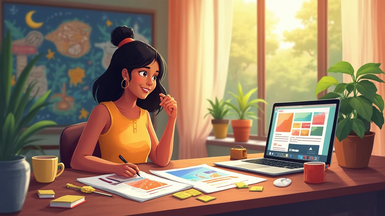
Colors, Fonts, and Images—No Guessing
Choosing colors, fonts, and images for your first website can feel overwhelming. But you don’t need to guess or get fancy. There are a few proven basics that instantly make your web design look good.
Start with color. The easiest trick? Pick two or three colors max. Use one main color for buttons or highlights, another for backgrounds, and maybe one more for small accents. Sites like Coolors and Adobe Color make it super easy to find color combos that work. Blue, by the way, is the world’s most popular website color—big brands like Facebook, Twitter, and LinkedIn all use it for a reason. Blue builds trust.
Now let’s talk fonts. Stick to simple and readable ones for your whole site. Google Fonts gives you tons for free, and you don’t need to mix a bunch. A good rule: one font for headings, one for everything else. Popular choices for beginners are Roboto, Open Sans, and Lato. Don’t use script or curly fonts for body text—nobody wants to squint.
Images can make or break your web design. Use high-quality pictures that make sense for your content. If you don’t have your own photos, grab free ones legally from Unsplash or Pexels. Don’t use too many big images, though; they slow down your site. Images should be clear and about the right size—not blurry, not gigantic.
- Use PNG or JPEG images. PNG is best for graphics and transparencies, JPEG for photos.
- Compress your images with free sites like TinyPNG to make sure your website loads fast.
- Add alt text to images. This helps people with screen readers and boosts your SEO.
Here’s a quick cheat sheet for beginners:
| Element | Beginner Tip |
|---|---|
| Colors | 2–3 matching colors, use a color palette tool |
| Fonts | Stick to 1–2 readable fonts like Roboto or Open Sans |
| Images | Use clear, legal, compressed images; add alt text |
Keeping it simple with colors, fonts, and images gives your site that clean, grown-up feel—even if it’s your very first web design project.
Staying Clear of Beginner Mistakes
Every web design rookie falls into the same traps at first. Knowing what not to do saves you time and fixes headaches before they start. Here’s what usually gets folks tripped up:
- Overloading your pages: More isn’t better. Don’t dump tons of images, fancy fonts, or crazy colors everywhere. It just makes your site messy and slow. People bounce fast from cluttered pages.
- Forgetting mobile users: It’s wild, but over 50% of web traffic now comes from phones and tablets. If your layout only works on a big screen, you’re missing out on half your visitors. Make sure your design shrinks or stacks nicely when viewed on a phone.
- Poor navigation: Ever land on a site and can’t find anything? If people can’t tell where to click, they’ll leave—even if your stuff is good. Always use a clear, visible menu up top or on the side.
- Ignoring basic SEO: Put key phrases—like web design, beginners, and website ideas—in your headings and page titles. Search engines use these to figure out what your site’s about. If you skip this, your site just gets lost in the crowd.
- Slow-loading pages: Big images can kill your load time. There’s a cool fact here: if a site takes more than 3 seconds to load, about 40% of people will bail.
| Common Mistake | Impact |
|---|---|
| No mobile design | Misses 50% of traffic |
| Slow load (4+ sec) | 40% of users leave |
| Cluttered look | Confuses visitors |
If you want to avoid these traps, keep things simple, test your site on your phone, and stick to a basic color palette. For images, use sites like TinyPNG or Squoosh to shrink file size without losing quality. And when it comes to web design for beginners, always Google your ideas and see what successful sites look like. Don’t fly blind—steal what works and skip what doesn’t.
Ready, Set, Launch: Final Checks
This last part makes all the difference. Before you tell the world about your site, you need to make sure everything works, looks right, and is easy to use. Even pros double-check before they hit publish. If you’re doing web design for beginners, a quick checklist saves loads of headaches.
- Mobile Responsiveness: Grab your phone or resize your browser window. Does your site look good on every screen? Over 50% of web traffic now comes from mobile devices, so don't skip this test.
- Broken Links: Click every menu item, button, and link, even the ones buried at the bottom. Nothing turns off visitors faster than a dead end.
- Load Speed: People are impatient—if your site takes more than three seconds to load, about 40% of visitors will bail early. Use free tools like Google PageSpeed Insights. Images too big? Compress them.
- Spelling and Grammar: Run a spell-check. Typos make you look sloppy, and if you're hoping to impress, details matter.
- SEO Basics: Add titles, descriptions, and headers with your website ideas keywords. It helps Google (and real people) find you.
- Forms and Contact Info: If you have a contact form or email link, fill it out yourself. Make sure you actually get the message. You’d be surprised how many people forget this one.
If you want a quick look at how your site compares, here’s a useful table with some base targets to aim for on launch day:
| Check | Good To Go |
|---|---|
| Loads in under (seconds) | 3 |
| Mobile-friendly | Yes |
| No broken links | 0 errors |
| Meta tags set | Yes |
| Contact forms work | Tested |
Take a deep breath. Once you’ve ticked these off, hit that Publish button! You’re live. Your first web design project for beginners is up and running. The real learning starts now—see how folks react and keep tweaking. Every pro started here.