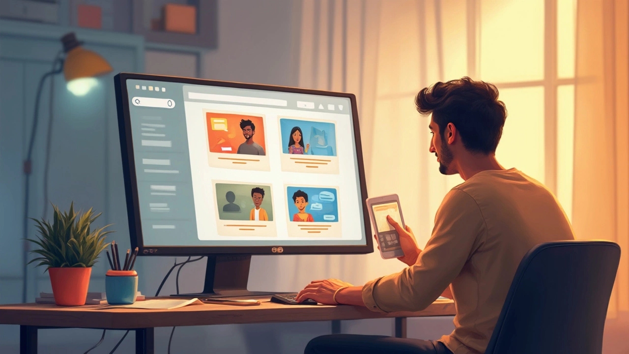
If you’re wrestling with layouts, colors, or endless lists of features, pump the brakes for a second. The first rule of web design is dead simple: keep it clean and make it easy. Nobody visits a site hoping to work hard, and most people bail out if things get messy or confusing. Even today, when you can code wild animations or load up on effects, the best sites still stick to basics—a clear message, obvious actions, and space for the eye to breathe.
Ever looked at Google’s homepage? Just a box and logo. That’s not by accident. Research out of Stanford and Google themselves shows users trust simple designs more and stay longer when they don’t have to hunt for what they need. Stuffing pages with widgets, popups, or huge banners feels clever in your head, but out in the wild, it leaves users annoyed or lost. So before you add something new, ask: will this make things clearer, or just slower?
- Why Simplicity Beats Complexity
- Common Mistakes That Break the Rule
- How to Nail Simple Web Design
- Tools and Examples to Stay on Track
Why Simplicity Beats Complexity
Think about your favorite websites. Bet they’re not packed with distractions or endless options. There’s a reason big players like Apple, Dropbox, and Airbnb put web design simplicity first—they know users want fast answers, not a puzzle.
When a site is simple, people don't have to waste time figuring out what to click next. A study from Google found that visitors judge a site’s beauty in just 50 milliseconds. If your website simplicity isn’t obvious, that visitor is probably gone before your fancy animation even loads.
Simplicity isn’t just about looks. It’s about focus: keeping attention on what actually matters. If you run a small business, for example, you want visitors to see what you do, not get lost in extra tabs or walls of text. The same goes for blogs, online stores, portfolios—clear, simple layouts help users stick around and do what you want them to do.
On top of that, simple sites are easier to use on phones, and mobile users make up over 60% of web traffic these days. If your menu is buried or your call-to-action is hidden, you’re leaving money on the table. Speed matters too. Google reports that as page load time rises from 1 to 3 seconds, bounce rates increase by 32%. Simple sites load faster, and faster sites win more visitors.
| Site Element | Impact of Simplicity |
|---|---|
| Navigation | Easier menus mean users stick around longer |
| Color Scheme | Limited colors help messaging stand out |
| Text | Short, clear copy keeps people engaged |
| Images | Few, high-quality images speed up loading |
Keep this in mind: every extra button, popup, or color might feel cool, but if it doesn’t do something useful for your users, it’s just noise. With user experience, less really is more.
Common Mistakes That Break the Rule
It’s wild how many sites break the “keep it simple” rule and end up shooting themselves in the foot. These aren’t just rookie mistakes—even seasoned designers sometimes go overboard. Here are the big ones to watch for:
- Cluttered Layouts: When your homepage tries to show everything at once—menus, banners, dozens of links—it just overwhelms visitors. People get stressed and click away fast.
- Too Many Fonts and Colors: It’s tempting to use lots of styles, but mixing fonts and wild colors makes your site feel messy and unprofessional. Stick to one or two fonts and a simple color scheme for a polished look.
- Unclear Calls To Action: If visitors don’t instantly know where to click or what to do next, you’ve lost them. Don’t hide what’s important behind useless buttons or small text.
- Slow Load Times: Loading a site with too many big images or videos isn’t just bad design—it kills your user experience. Google says more than half of visitors leave if a mobile site takes over 3 seconds to load.
- Information Overload: Dumping giant blocks of text or endless lists on a single page turns people off. Break up info, use bullet points, and make every word count.
| Mistake | Impact on Users |
|---|---|
| Heavy pop-ups | Disrupts flow, increases bounce rate |
| Hidden navigation | Causes frustration, users get lost |
| Autoplay videos | Annoys visitors, especially on mobile |
A classic stat from Google’s research: 61% of users are unlikely to return to a mobile site they had trouble accessing. Making these mistakes chases your audience away—and it’s all avoidable. Stick to simple layouts, highlight key actions, and trim anything that doesn’t help the main goal. Your web design has one job: get people what they need, fast.
How to Nail Simple Web Design
Getting web design right doesn’t mean stripping your site down to plain text, but you do want to cut what’s not needed. The goal? Make it dead easy for people to read, click, or buy. Here are some practical tips that really work.
- Use Clear Navigation: Don’t hide links or bury them in funky menus. The top nav bar should have what matters—no guessing games. If people can’t find your menu, you lose them in five seconds flat.
- Limit Your Colors: Stick to two or three main colors. Wild rainbow pages are more distracting than helpful. Even huge brands like Apple base their sites on one simple color palette.
- Make Fonts Readable: Forget artsy fonts. Go for basic sans-serif like Arial or Roboto. Keep body text big enough (16px is usually safe) and headers thick and clear.
- Whitespace Isn’t Wasted Space: Don’t crowd things together. Extra space around headlines and buttons makes everything easier to spot and click.
- One Main Action per Page: If you want a click, sign-up, or buy, make the main button obvious. Don’t give folks five things to think about at once—they’ll just freeze or bounce.
- Test on Real Devices: Phones, tablets, huge monitors—check them all. Even the best website simplicity falls apart if buttons vanish on mobile.
The user experience (UX) is what it all comes down to. If your mom, a teenager, and a first-time visitor can all zip through your site without a guidebook, you’ve nailed it. And if you want proof that simple works, check this out:
| Design Type | Bounce Rate | Average Time on Site |
|---|---|---|
| Minimalist | 36% | 2:47 min |
| Cluttered | 59% | 1:02 min |
These numbers from a Crazy Egg study show simple sites keep people on the page longer and cut bounce rates nearly in half. Less truly is more once you see it in action.
Tools and Examples to Stay on Track
It’s easy to lose sight of simplicity, especially when you’ve got a dozen cool plugins and a wild color palette tempting you. But some practical tools can pull you back to basics when designing with web design and great user experience in mind.
First up, use a wireframing tool like Figma or Sketch. These strip designs down so you can see what really matters, and force you to focus on content and flow without getting sidetracked by details. These tools are free to start and used by both solo beginners and massive companies.
Accessibility checkers like WAVE or Google Lighthouse can help spot clutter, confusing links, or stuff that might break your user’s experience—especially for people using screen readers or phones. If your site lights up with errors here, it’s almost always because it’s gotten too busy.
Now look at websites that nail it. Craigslist might not win beauty contests, but you can find anything you want in seconds because it sticks to the simplicity rule. Apple’s homepage is another classic—they could cram every product they sell on the main page, but you get a clean look and just one or two spotlighted gadgets. That choice isn’t about ego, it’s about making life easy for you.
Want to see how simple design impacts the numbers? Check this out:
| Site Type | Bounce Rate (Cluttered) | Bounce Rate (Simple) |
|---|---|---|
| E-commerce | 55% | 34% |
| Blogs | 70% | 50% |
Less mess usually means people actually stick around. If you feel the itch to add extra stuff, go look at sites you use every day. You’ll probably find the ones you love most are the ones that just get you where you need to go, fast.
- Use a site map tool like Slickplan to check your layout and see if you can delete extra pages or steps.
- Try testing your site on your phone; if it feels cramped or takes longer to load, it’s time to trim things down.
- Ask a real person (not just your team) to find something on your site while you watch, no hints. If they pause or ask questions, you’ve spotted a pain point.
Simple website design isn’t about being boring—it’s about putting users first. Keep these tools handy, and you’ll stay far away from cluttered, frustrating designs.