Landing Page Conversion Rate Optimizer
See how much you're losing with common landing page mistakes and calculate potential gains from specific improvements. Based on real data from Unbounce, Leadpages, and WordStream.
Your Current Performance
Based on your inputs
Most people think landing pages are just web pages you send traffic to. But here’s the truth: landing page success rate isn’t about design, color, or even copy. It’s about whether the person who clicked your ad, email, or social post actually did what you wanted them to do. That could be buying something, signing up, downloading a guide, or booking a call. And the numbers? They’re not what you’d expect.
What’s a Real Landing Page Success Rate?
Average landing page conversion rates hover around 2.35% across all industries. That’s the number you’ll see in reports from HubSpot, Unbounce, and WordStream. But averages lie. The top 10% of landing pages convert at over 10%. Some even hit 20% or higher. So why the huge gap?
It’s not luck. It’s alignment. When the message on your ad matches exactly what’s on the landing page - and that message solves a specific, urgent problem - conversion rates jump. A study by Unbounce tracked 10,000+ landing pages over two years. Pages with a clear headline that matched the ad copy had 3.5x higher conversions than those that didn’t. Simple. No magic.
Why Most Landing Pages Fail
Most landing pages fail because they try to do too much. They have navigation menus. They link to the homepage. They include testimonials, blog links, social icons, and a newsletter signup form all in one place. That’s not a landing page. That’s a homepage with a fake name.
Think of a landing page like a one-way street. You’re not inviting people to explore. You’re guiding them to one action. If you give them five options, they’ll pick none. A 2023 report from Unbounce showed that landing pages with no navigation links converted 28% better than those with even one. That’s not a small boost. That’s the difference between 2% and 2.5% - or 10% and 12.8%.
Another big mistake? Asking for too much information. If you’re selling a $7 ebook, don’t ask for their company size, job title, and phone number. That’s a barrier. The average form abandonment rate on landing pages is 70%. Every extra field increases that. A/B tests from Leadpages show that reducing form fields from seven to three boosted conversions by 50%.
What Actually Moves the Needle
High-converting landing pages share three traits:
- A clear, single goal - one button, one action, one outcome.
- Relevant, specific copy - not generic fluff. Use the exact words your audience uses when they search.
- Trust signals that matter - not stock photos of smiling people. Real logos, real testimonials, real guarantees.
Take a SaaS company in India that sells project management tools. Their landing page originally had a generic headline: "Best Project Management Software." Conversion rate: 1.8%. They changed it to: "Tired of missing deadlines? Get your team on track in 5 minutes - no training needed." They added a short video showing exactly how it works. Conversion rate jumped to 8.7%. The difference? Specificity. Real pain. Zero fluff.
Another example: an online course creator. Their page had five testimonials. All were long paragraphs. They replaced them with three short quotes, each paired with a photo of the person and their job title. Conversion went from 3.1% to 9.4%. Why? People trust people - not vague praise.
WordPress Landing Pages: What You Need to Know
If you’re using WordPress to build landing pages, you’re not starting from scratch. But most themes are built for blogs, not conversions. A typical WordPress theme includes sidebars, footers, menus, and widgets - all of which distract from your goal.
Use a dedicated landing page plugin like Elementor, Thrive Architect, or Leadpages. These let you build a page with zero navigation. No header. No footer. Just the message and the button. You can even remove the WordPress admin bar for visitors so they don’t see login links.
And don’t rely on pre-made templates. They’re designed to look good, not convert. A template that works for a fitness coach in the U.S. won’t work for a financial advisor in Mumbai. Your audience speaks differently. Their fears are different. Their trust triggers are different.
Test this: take your current landing page. Remove everything except the headline, one short paragraph, and the CTA button. That’s your baseline. Now test adding back one element at a time. See what moves the needle. That’s how you find what works for your people.
How to Track Your Real Success Rate
You can’t improve what you don’t measure. Google Analytics 4 is free. Set it up. Create a goal for your landing page. It could be a form submission, a button click, or a page view after a purchase. Track it.
But don’t just look at the overall number. Look at the source. Are people from Facebook converting better than Google Ads? Are mobile users dropping off? Are they leaving because the page takes too long to load? A 3-second delay cuts conversions by 40%. Use PageSpeed Insights. Optimize images. Use caching. Don’t ignore this.
Also, use heatmaps. Tools like Hotjar show where people click, scroll, and hover. If no one’s clicking your CTA button - even though it’s red and big - maybe it’s buried. Maybe the headline doesn’t match the ad. Maybe the value isn’t clear. Heatmaps don’t lie.

Quick Fixes That Work (Right Now)
Here’s what you can change today:
- Change your headline to match the ad or link that brought people here.
- Remove every link except your main CTA button.
- Reduce form fields to three or fewer.
- Add one real testimonial with a photo and job title.
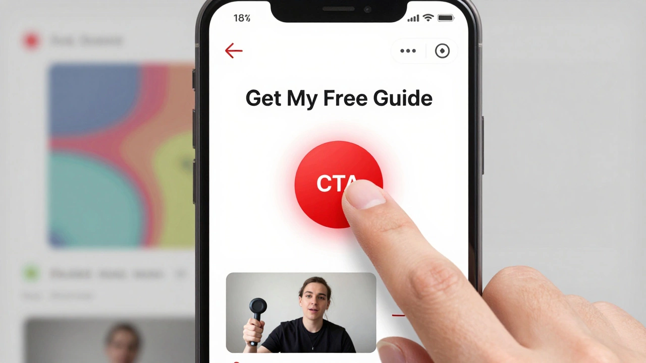
- Make sure your CTA button says what happens next: "Get My Free Guide," not "Submit."
Do these five things and you’ll likely see a 20-50% increase in conversions. No need for fancy tools. No need for a redesign. Just clarity.
What’s a Good Landing Page Success Rate?
There’s no universal number. But here’s a rough guide:
- Below 2% - You have serious issues. Rebuild from scratch.
- 2-5% - Average. You’re not failing, but you’re leaving money on the table.
- 5-10% - Strong. You’re doing better than most.
- 10%+ - Excellent. You’ve nailed alignment between your offer and your audience.
Remember: success isn’t about the number. It’s about whether your landing page is doing its job: turning visitors into people who take action. If it’s not, it’s not a landing page. It’s a ghost page.
What is a good landing page conversion rate?
A good landing page conversion rate is between 5% and 10%. Below 2% means you need to fix major issues. Above 10% is excellent and means your message, offer, and audience are tightly aligned. The average across industries is 2.35%, but top performers regularly hit 15% or more by focusing on clarity and trust.
Do WordPress themes affect landing page success?
Yes, but not because of design. Most WordPress themes come with navigation menus, sidebars, and footers that distract visitors. A landing page should have one goal - one button. Use a landing page builder like Elementor or Thrive Architect to strip away everything except the headline, a short message, and the call-to-action. Avoid using blog themes for landing pages.
How many form fields should a landing page have?
For most offers, three form fields is the sweet spot. Name, email, and one other - like a phone number or company size. Every extra field increases abandonment. A/B tests show that reducing from seven to three fields can boost conversions by 50%. Only ask for what you absolutely need to deliver the offer.
Should I use testimonials on my landing page?
Yes - but only if they’re real. Generic quotes like "This product changed my life!" don’t work. Use photos, names, job titles, and specific results. For example: "I reduced my team’s meeting time by 60% using this tool - Sarah, Operations Manager, Bangalore." Real people build trust. Stock photos and vague praise don’t.
What’s the biggest mistake on landing pages?
The biggest mistake is trying to do too much. Adding links to your homepage, blog, or social media distracts visitors. A landing page isn’t a website - it’s a one-way street. Remove all navigation. Remove all options. Make one path: click here, get this. That’s how you turn visitors into customers.