One-Page Website Suitability Analyzer
Describe Your Project
Select all options that apply to your situation:
Your Analysis Will Appear Here
Select your project characteristics and click "Analyze My Situation" to get personalized recommendations.
You scroll. You click. You bounce. That’s the modern user experience in a nutshell. With attention spans shrinking and mobile usage dominating traffic, the debate over one-page websites has never been more relevant. Is this minimalist approach a brilliant shortcut to conversion, or a SEO nightmare waiting to happen?
The short answer is: it depends entirely on what you’re trying to achieve. A one-page site isn’t a magic bullet, nor is it a dead end. It’s a specific tool for a specific job. If you use it correctly, it can streamline your message and boost conversions. If you misuse it, you’ll bury your content under an endless scroll that confuses visitors and alienates search engines.
Let’s break down exactly when a single-page layout works, when it fails, and how to build one that actually performs in 2026.
What Exactly Is a One-Page Website?
A One-page website is a digital presence where all core information resides on a single HTML document, accessed via vertical scrolling rather than clicking through multiple internal pages.
Unlike traditional multi-page sites that have separate URLs for About, Services, Blog, and Contact, a one-pager consolidates everything into distinct sections within one long scroll. Navigation usually happens through anchor links (like `#services` or `#contact`) that jump you to different parts of the same page.
This format gained massive popularity with the rise of mobile devices and parallax scrolling effects around 2014-2015. While the hype has cooled, the utility remains strong for specific business models. It’s not just about aesthetics; it’s about reducing friction. Fewer clicks mean less cognitive load for the visitor.
When a One-Page Site Makes Perfect Sense
Not every business fits this model. In fact, most don’t. But if you fall into one of these categories, a single-page design might be your best strategic move.
- Personal Portfolios: If you’re a photographer, designer, or writer, your work speaks for itself. You don’t need a corporate history. You need a gallery, a brief bio, and a way to hire you. A one-pager keeps the focus on your visuals.
- Landing Pages for Campaigns: Running a paid ad campaign? Send traffic to a dedicated one-page site focused solely on converting that click into a lead or sale. No distractions, no navigation menu leading them away.
- Event Promotion: Hosting a conference, wedding, or product launch? The key details-date, time, location, agenda, ticketing-are finite. A single scroll tells the whole story without forcing users to hunt for info.
- Local Service Businesses: Think plumbers, electricians, or tutors. People searching for "plumber near me" want three things: proof you exist, proof you’re good, and a phone number. They don’t care about your company mission statement from 2019.
- Product Launches: Introducing a new app or gadget? A one-page site acts as a teaser trailer. It highlights features, shows screenshots, and drives pre-orders.
In these scenarios, brevity is a feature, not a bug. You’re guiding the user through a linear narrative.
The Hidden Costs: Why One-Pagers Often Fail
For every success story, there are dozens of businesses that ruined their online presence by forcing a complex operation into a single page. Here’s where the cracks show up.
SEO Limitations Are Real
Search engines like Google crawl and index individual pages. Each page represents a unique topic opportunity. If you have only one URL, you have only one chance to rank. You can’t optimize one page for "best running shoes," "marathon training tips," and "buy orthopedic inserts" simultaneously without creating keyword cannibalization.
Multi-page sites allow you to build topical authority. You can have a blog post about "How to Choose Running Shoes" linking to a product page for "Trail Runners." This internal linking structure signals relevance to search algorithms. A one-pager lacks this depth. You’re essentially putting all your eggs in one basket.
User Experience Friction
While scrolling feels natural on mobile, it becomes tedious on desktop. Imagine a user wants to share your contact information but keep your portfolio open. On a multi-page site, they can open two tabs. On a one-pager, they have to scroll back and forth constantly.
Also, consider the "above the fold" problem. If your value proposition isn’t clear in the first screenful of pixels, users bounce. There’s no secondary page to catch them if they’re confused initially. Everything must be perfect immediately.
Content Scaling Issues
Startups grow. What starts as a simple service list expands into case studies, team bios, FAQs, and legal disclaimers. Eventually, your one-pager becomes a 10,000-word novel. At that point, it’s harder to navigate than a traditional site. You’ve created a maze instead of a map.

One-Page vs. Multi-Page: The Decision Matrix
| Feature | One-Page Website | Multi-Page Website |
|---|---|---|
| Development Cost | Low ($500 - $2,000) | Medium to High ($2,000 - $10,000+) |
| SEO Potential | Limited (Single URL) | High (Multiple Keywords/Topics) |
| User Journey | Linear, Guided | Non-linear, Exploratory |
| Maintenance | Easy (Fewer files) | Complex (CMS updates) |
| Best For | Portfolios, Events, Startups | E-commerce, Blogs, Corporate |
| Analytics Depth | Basic Scroll Heatmaps | Full Funnel Tracking |
Use this table as a quick filter. If your budget is tight and your goal is immediate visibility for a simple offer, go one-page. If you plan to scale, publish regular content, or sell multiple products, start with a multi-page architecture.
Design Rules for a Successful Single-Page Site
If you’ve decided a one-pager is right for you, execution is everything. A poorly designed single page looks amateurish. A well-designed one feels immersive.
- Stick to a Logical Flow: Follow the AIDA model: Attention (Hero Section), Interest (Features/Benefits), Desire (Social Proof/Testimonials), Action (Contact/CTA). Don’t randomize the order.
- Make Navigation Sticky: Users should always know where they are. Keep a fixed header with anchor links so they can jump to the "Contact" section without scrolling back up manually.
- Optimize for Mobile First: Most users will view your site on a phone. Ensure touch targets are large enough and text is readable without zooming. Parallax effects often lag on mobile; skip them if performance suffers.
- Use Clear Visual Hierarchy: Break up sections with whitespace, contrasting colors, or subtle background changes. Without visual breaks, the eye glazes over. Think of each section as a chapter in a book.
- Speed Is Non-Negotiable: Since there’s only one page, it loads once. But if that page is heavy with images and scripts, users leave before it renders. Compress images, minify CSS/JS, and leverage browser caching. Aim for under 2 seconds load time.
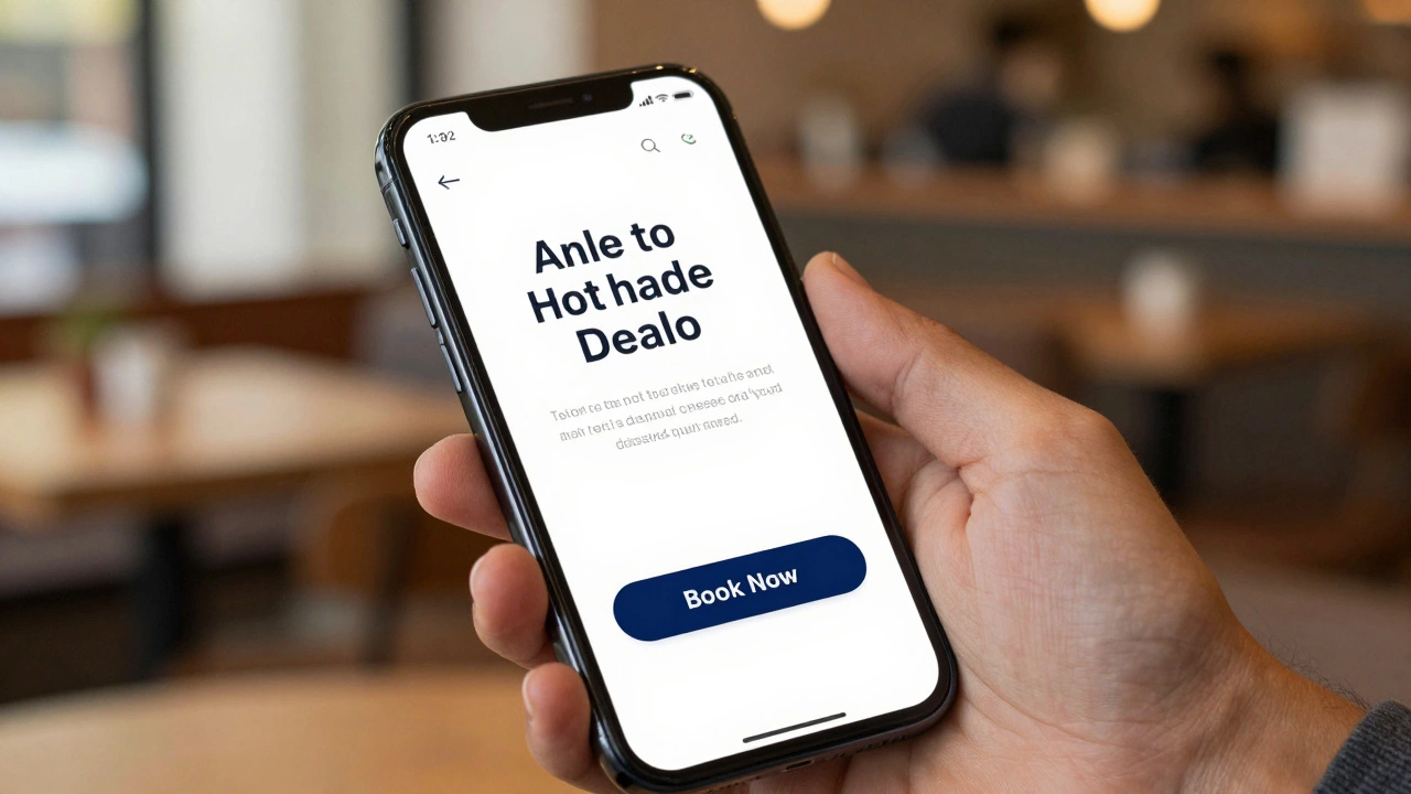
- Include a Strong Call-to-Action (CTA): Don’t make users guess what to do next. Place primary CTAs above the fold and repeat them at the end of key sections. "Book Now," "Download Guide," or "Call Us" should be impossible to miss.
Can You Combine Both Approaches?
Absolutely. The hybrid model is becoming the standard for growing businesses. You can have a sleek, high-converting one-page homepage that serves as your digital front door, linked to a deeper multi-page backend for blogs, detailed service pages, and support documentation.
This gives you the best of both worlds: the immediate impact of a one-pager for new visitors, and the SEO depth of a multi-page site for organic growth. Many successful SaaS companies use this tactic. Their homepage is a polished sales pitch, while their resources section is a sprawling library of articles.
Common Mistakes to Avoid
I’ve seen too many one-pagers fail because of basic oversights. Here’s what to watch out for:
- Hiding Contact Info: Never bury your phone number or email in the footer. Make it accessible from every section.
- Overloading Content: Just because it’s one page doesn’t mean you can dump your entire business plan onto it. Edit ruthlessly. If it doesn’t drive conversion, cut it.
- Ignoring Analytics: Install tools like Google Analytics and Hotjar. Track scroll depth. If 80% of users drop off after the second section, your opening hook isn’t working.
- Using Auto-Scroll: Let users control the pace. Forced auto-scrolling is annoying and inaccessible for people with motor impairments or slow connections.
Final Verdict: Should You Go One-Page?
Ask yourself one question: "Do I need to explain my business in five minutes or five hours?"
If five minutes is enough, a one-page website is a powerful, cost-effective tool. It forces clarity, improves mobile experience, and simplifies development. It’s ideal for freelancers, event organizers, and early-stage startups testing a market.
If your business requires education, comparison, or trust-building through extensive content, stick to a multi-page structure. Don’t sacrifice depth for simplicity if depth is what sells your product.
In 2026, users expect speed and clarity. Whether you choose one page or ten, ensure every pixel earns its place. Simplicity wins, but only when it serves the user’s intent.
Is a one-page website bad for SEO?
Not inherently bad, but limited. Since you have only one URL, you can only target a narrow set of keywords effectively. You miss out on ranking for long-tail queries that require dedicated pages. However, if your local SEO is strong and your page loads fast, you can still rank well for branded and high-intent terms.
How much does a one-page website cost?
Costs vary widely. DIY templates on platforms like Squarespace or Wix range from $15-$30 per month. Hiring a freelance designer typically costs between $500 and $2,000. Agency-built custom one-pagers can exceed $5,000 depending on animations and functionality.
Can I add a blog to a one-page website?
Technically yes, but it’s not recommended. Embedding a blog feed on a one-pager clutters the design and hurts SEO. Instead, link out to a separate multi-page blog domain or subdomain. This keeps your main page clean while allowing you to publish regular content for search engine optimization.
Are one-page websites good for e-commerce?
Generally no. E-commerce relies on product categorization, filtering, and individual product pages for SEO. A one-pager cannot handle inventory scaling or provide the detailed shopping experience customers expect. Only consider it if you sell a single product with no variations.
Which platform is best for building a one-page site?
For beginners, Squarespace and Wix offer drag-and-drop one-page templates. For developers, HTML/CSS/JavaScript combined with frameworks like Bootstrap provides maximum control. WordPress can also be used with plugins like Elementor, though it may be overkill for a simple static page.